

Whether we admit it or not, we all judge books by their covers; their bright or somber designs attracting or repelling us.
F Scott Fitzgerald was so impressed with the book cover art for The Great Gatsby, that he even wrote the image into the novel.
And now The Morgan Library & Museum is showing 100 of the outstanding examples of American literature in Gatsby to Garp: Modern Masterpieces from the Carter Burden Collection.
The exhibition brings together first editions, manuscripts, letters, and revised galley proofs. But aside from the great books themselves, the design of their covers is fascinating, showing a progression in styles from the 1920s to the present day.
The Roaring Twenties saw the birth of modern book design. Although the use of dust jackets was developed in the previous century, it was not until the second decade of the 20th century that the art of book covers became graphically bold and colorful.
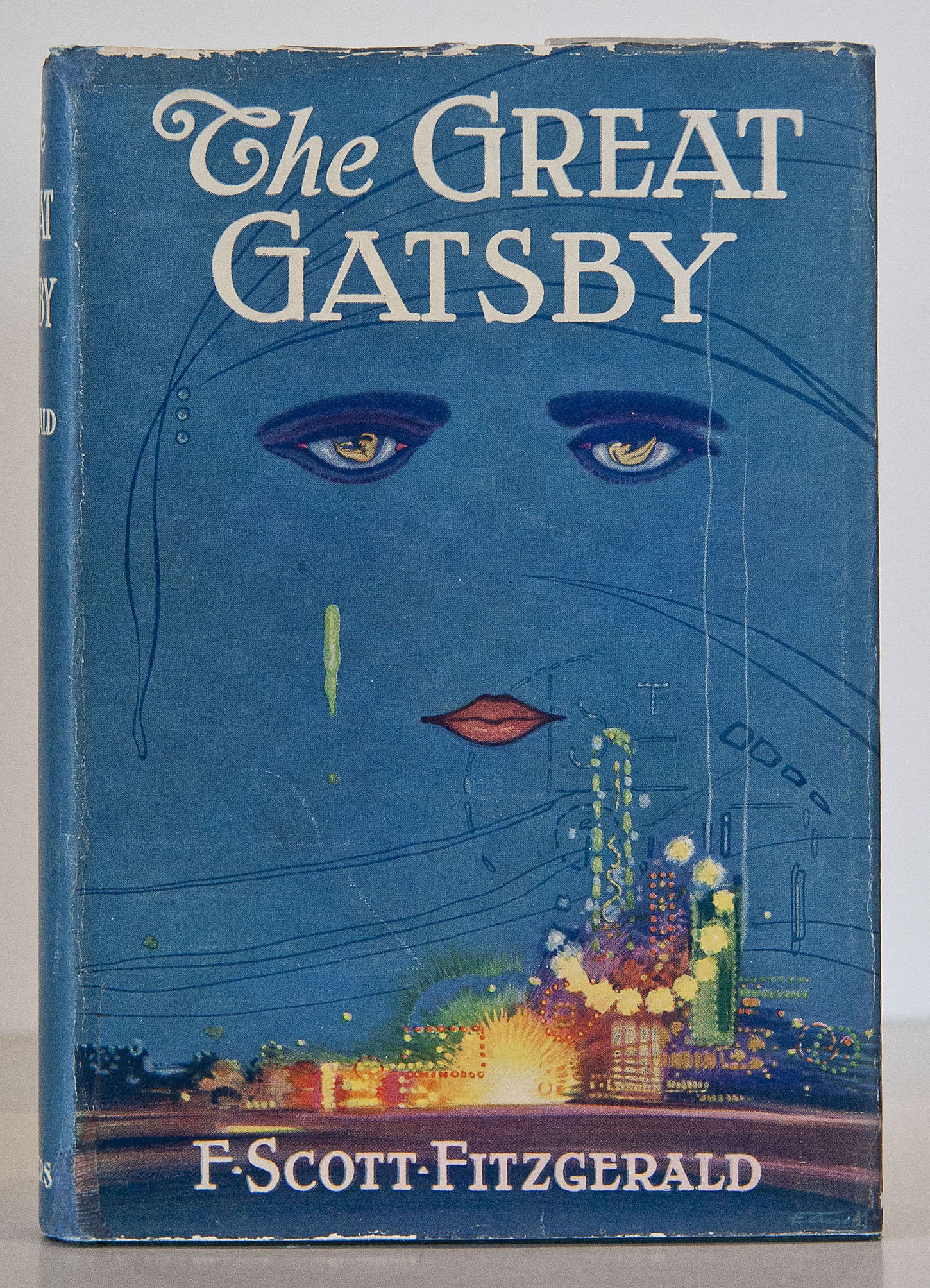
GATSBY… Carrow says ‘This could be printed without the type and everyone would know which book it was’.
Francis Cugat’s arresting Art Deco dust jacket design for The Great Gatsby is one of the most iconic. The jacket’s most prominent feature – the staring, melancholy eyes of a woman – influenced Fitzgerald’s narrative: after reviewing an early draft of the design, he told the publisher he had ‘written it in’ to the novel.
Dust jackets – which are by their nature discarded, or easily torn or lost – were originally intended to protect a book’s binding, and those that have survived are highly valued by collectors.
Jenny Carrow, an award-winning book jacket designer, has given Boo York City an exclusive insight into how these book covers were designed and the artistic philosophy behind them.
She said: “A really great jacket design catches your eye from across the room and stays with you for a long time. It is often something bold or clever, a beautiful photograph, a striking illustration, or great typography that captures the character of the book.”
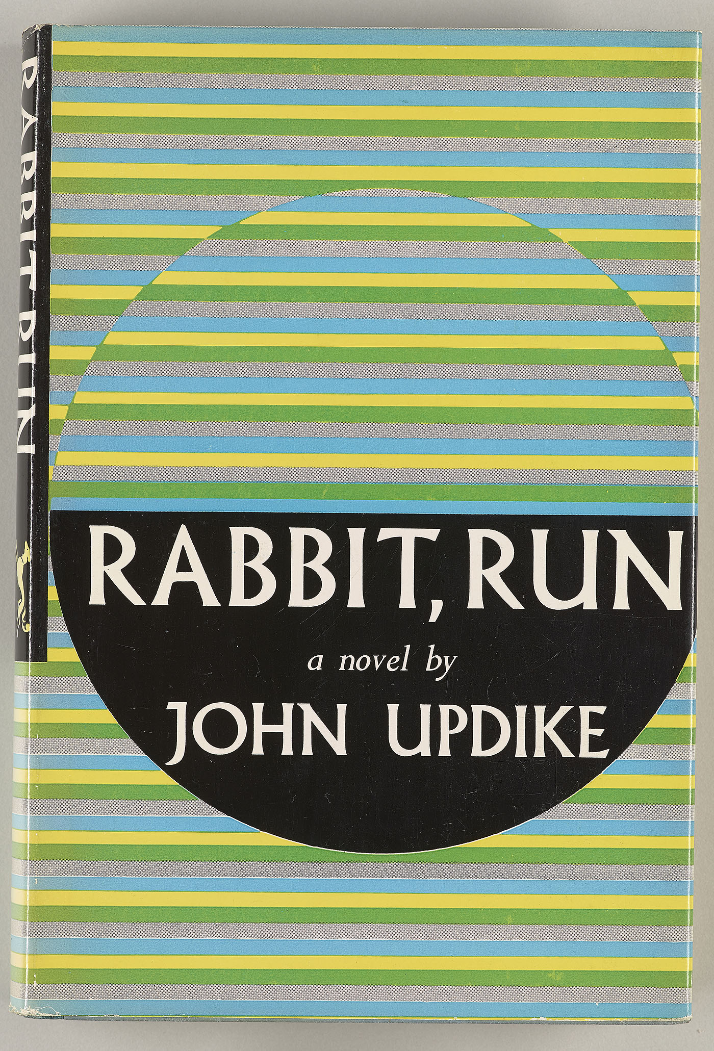
RABBIT, RUN… This book cover ‘is the perfect reflection of the optical art happening that decade.’
Between 1973 and 1996, Carter Burden – a former trustee of the Morgan Library & Museum – assembled the greatest collection of modern American literature in private hands, including focused concentration on such movements as the Lost Generation, the Beats, and the Harlem Renaissance.
Carrow said: “At the exhibition, there is definitely a progression from representation to abstraction and ornamentation to simplicity. Many of the jackets would feel just as fresh today, because of either their iconic designs or the current trend of vintage typography.
“While I can imagine seeing many of these classic book covers in stores or online today, the biggest differences might actually be in how they were designed and printed.
“Before the computer, jackets were carefully crafted and pasted up. Revisions were much more time consuming. You can see the handwork in these jackets, even when a font is used. The designer’s hand shows in the unique letterforms and the soft lines.
“These designs have a warmth that digital files can sometimes lack and that designers today are working very hard to recreate. The colors on the classic jackets are beautifully saturated and the paper stock even feels so different from what we use now.
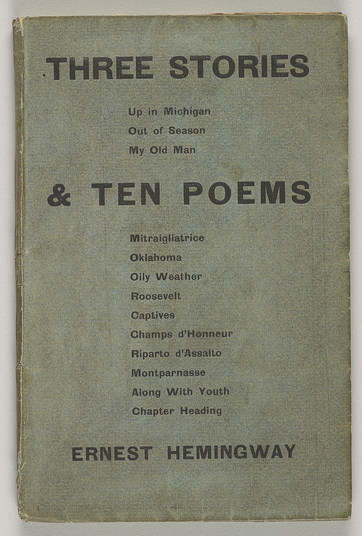
THREE STORIES & TEN POEMS… ‘It reads as a table of contents, but the design is elevated to classic object.’
“Bookshelves are more crowded today, so covers have to compete against one another for a reader’s attention.”
Carrow moved to New York 15 years ago to study painting, drawing, graphic design and printmaking at Cooper Union. And thanks to a chance meeting with a creative director after she graduated, she’s been designing book covers ever since.
She said: “There are many theories and many opinions about book design. My working theory is to make it great, but make it right for the book. The tone of your design should match the tone of the writing. You want the reader to be excited enough to pick up the book, but leave some mystery for their imagination.

AGAINST HAPPINESS…Carrow’s favourite work of her own book cover designs, which is eye-catching and bold
“My favorite cover of my own work from a few years back would have to be Against Happiness by Eric G. Wilson. The simple elements came together perfectly and it was such a pleasure to design.
“But from the exhibition, I’d have to choose the William Carlos Williams’ book cover for Paterson. The designer, Alvin Lustig, created an incredible body of work during his short life. His designs are truly works of art. He did incredible things with color and texture and had such a unique style.”
“The modernist gem of Paterson was part of Lustig’s portfolio for the New Directions New Classics series. I love seeing this entire body of work together, since Lustig had such a distinct geometric style with a limited palette. Lustig was also a designer of fabric, furniture and architecture. His playful lines and shapes can be seen in everything he created.”
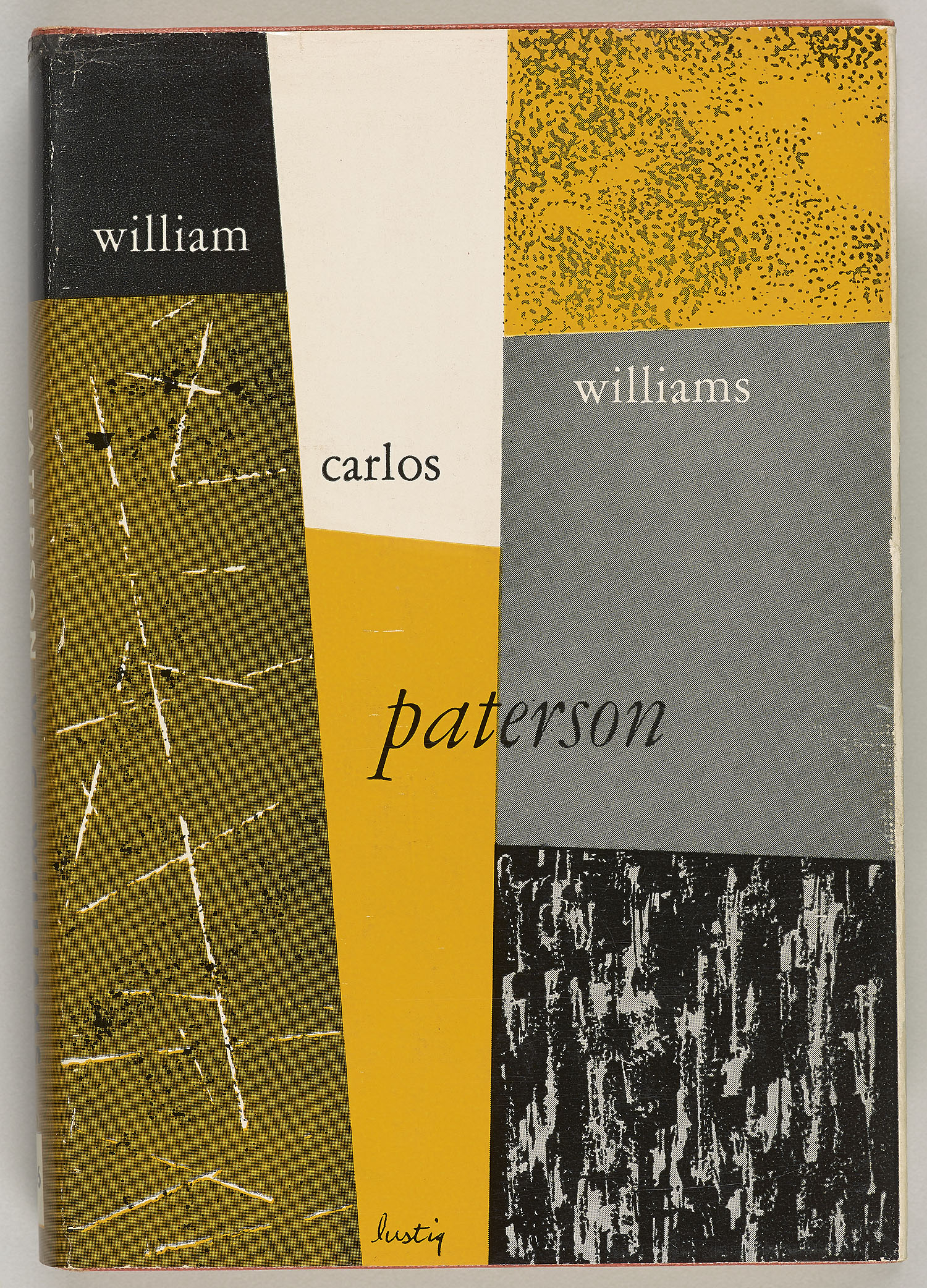
PATERSON… ‘Alvin Lustig did incredible things with color and texture and had such a unique style.’
“This has to be one of the most iconic book covers of the last century. It was originally published in 1925 and the original gouache painting was created by Francis Cugat.
“The painting, with it’s dramatic eyes and glowing city, is so well known that the jacket could be printed without the type and everyone would know which book it was.
“As a designer, I am always so curious to hear the backstory of any jacket, to see the great ideas that were killed and the early sketches. Sketches by Cugat were discovered in 1990, showing more of a quiet Long Island landscape. So glad they decided to use the city at night.”
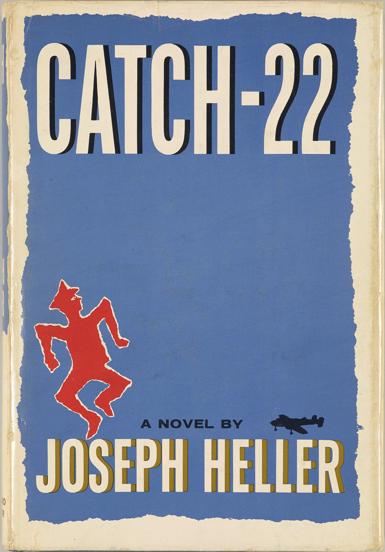
CATCH-22… ‘Bacon is credited with starting the “big book look” and he has designed more than 6,000 jackets.’
“Rabbit, Run was first published in 1960. The designer is unknown, but the jacket is the perfect reflection of the optical art happening that decade.
“While the design is not as iconic as Gatsby, it’s nice to see that the striking jacket has been reworked for today’s bookshelves with a nod to it’s original. Other photographic versions of the cover have been published between the first printing and the current one.”
“I’m drawn to Catch-22 because the jacket was designed by Paul Bacon. While this particular jacket is not one of my favorites, especially compared to his genius design for Heller’s “We Bombed in New Haven”, Bacon has had an incredible design career.
“He is credited with starting the “big book look”, which is so often requested today, and he has designed more than 6,000 jackets and 200 jazz album covers from the 1950s to 2000s. Many of the bestsellers from the 70s and 80s were designed by Bacon.”
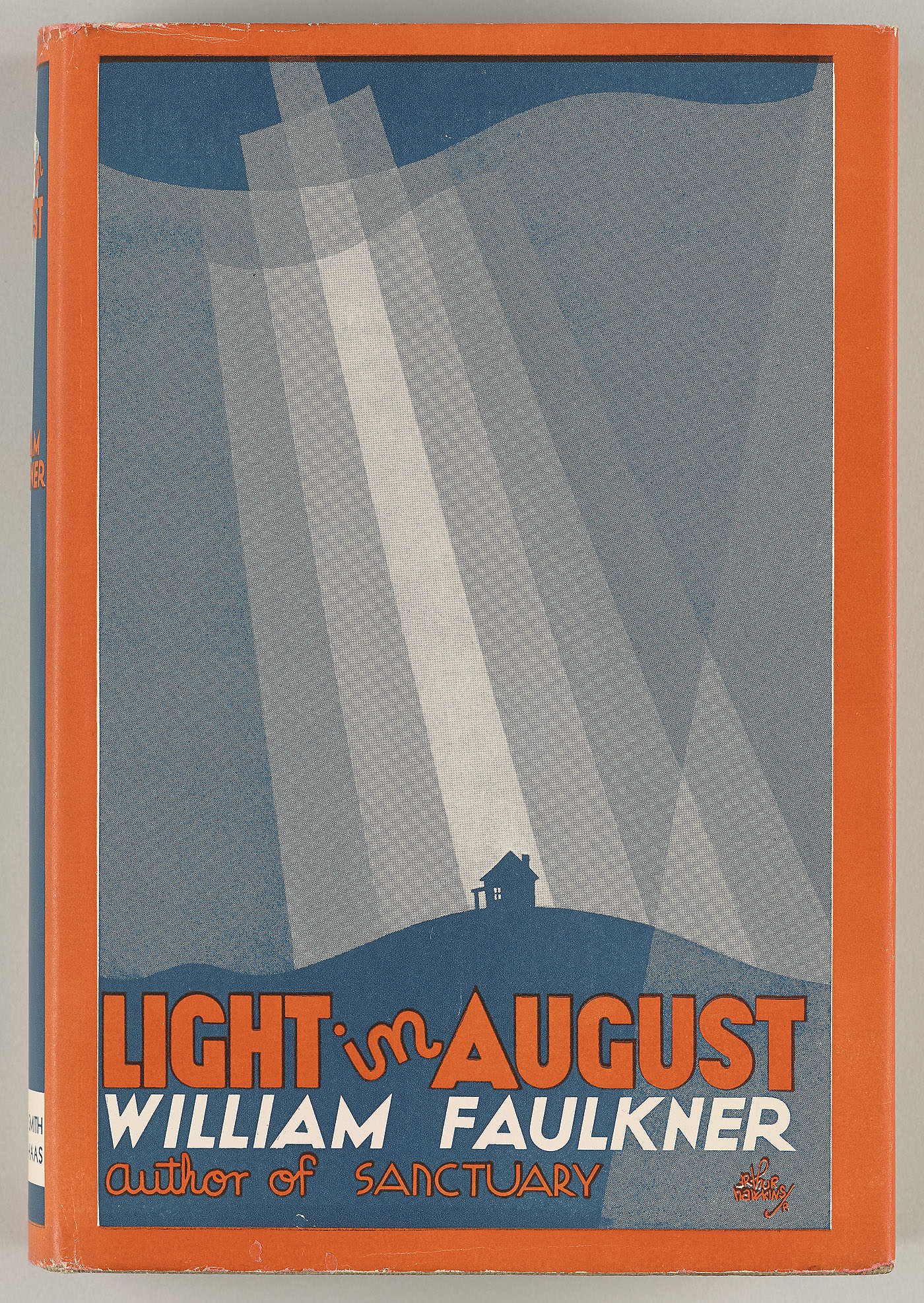
THE LIGHT IN AUGUST…created by Arthur Hawkins Jr had ‘impressive and stylistic portfolio’.
“The Faulkner jacket is a striking and simple two color poster like design. It was created by by Arthur Hawkins, Jr., who was not as prolific as Alvin Lustig, but should still be recognized for his impressive and stylistic portfolio.”
“For me, Three Stories & Ten Poems is the most under-designed jacket in the exhibition. It reads as a table of contents, but the design is elevated to classic object through its production (possibly letterpress on that toothy blue uncoated stock). And, of course, being a first-edition Hemingway doesn’t hurt.”
*The Carter Burden exhibition is on at The Morgan Library & Museum until September 7, 2014. Admission is free on Fridays from 7pm till 9pm and costs $18 for adults and $12 for students, seniors and children under 16 at all other times.
*Cover photo: The Catcher in the Rye by JD Salinger. Artwork by E Michael Mitchell
About the Author: Boo Paterson
« Top 10 vintage spots at biggest arts festival Shrink turns agony into comedy »